Amazon Grocery — Product Design
This project didn't start with a surface redesign. It started with a question no one had asked yet: what if every screen in the delivery flow was the right screen for fresh food? Seven surfaces, six weeks, and one systems-level reframe later — perishables had a home on Amazon.
Client
Type
Year
The customer problem + design challenge
Amazon's delivery app was built for shelf-stable goods. When Same-Day delivery program needed to drive perishables adoption, the default move was to add a module or two. We didn't take it.
The real problem: customers weren't avoiding fresh food because it was hard to add — they were avoiding it because the app never told a coherent story about it. No moment of discovery. No signal of freshness. No reason to trust that bananas ordered on Amazon would arrive the way you'd want them. We mapped every surface a customer touches in a delivery session and asked the same question at each one: does this screen do anything for fresh? Almost none of them did.
The design challenge wasn't a single screen. It was building a perishables-native experience inside an infrastructure that wasn't built for perishables — without requesting new surfaces or touching the core search architecture.
Questioning every surface
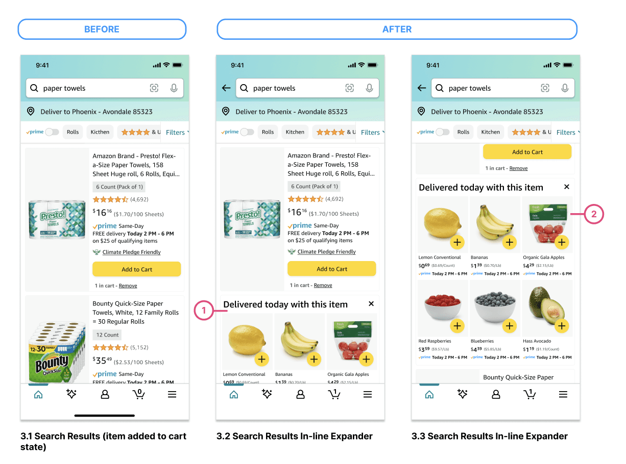
We identified seven surfaces where perishables' discovery could happen and systematically redesigned each one. Post-add-to-cart in Search. An inline expansion slot. A Top Selling Produce widget in Cart. Smartwagon on the product detail page. A Before You Go page between checkout and order confirmation. Product tile and grid view treatments for produce in Search. Each surface had a different user mindset, a different level of intent, and a different design constraint.
The through-line: every intervention had to respect the customer's current task while opening a door to fresh. Not a hard sell. A visible shelf.

Best moment in the journey
The highest-converting surface turned out to be the one least expected – the interstitial page called "Before You Go". The order confirmation screen was a dead end — your order was placed, here's your summary, goodbye. We proposed a Before You Go page: a curated perishables recommendation surface right before you checkout. A full page that mimics a "grocery aisle" filled with easy to choose items.
Customers responded to the utility framing in qualitative sessions in a way they didn't respond to anything that felt promotional.

Results + Reflection
+40% lift in repeat perishables purchase rate. +18% fresh add-to-cart from Before You Go alone. 3× perishables discovery rate versus the organic browse baseline.
The 40% lift didn't come from any single surface. It came from changing the cumulative signal across the whole session — every surface we touched added another paragraph to the story the app tells about fresh delivery. The lesson: in a system this large, a single brilliant screen changes nothing. A coherent narrative across every touchpoint changes behavior.
Don't ask which screen to fix. Ask whether the app is telling a story — and if not, start writing it.